
The Fourth article in the “Finding Geometry in Nature” series
As a Polish-British artist working from my Southend-on-Sea studio, I’ve discovered that mastering color theory is essential for creating compelling geometric nature abstractions. In this article, I’ll share my approach to developing seasonal color palettes that capture the essence of British flora while maintaining contemporary appeal.
The 2025 Color Landscape
The art world in 2025 is embracing several key color trends that align perfectly with geometric nature art:
- Bold contrasts and earthy elegance – combining vibrant accents with grounded natural tones
- Seasonal color palettes inspired by natural elements and changing landscapes
- Color-blocking techniques with geometric patterns
- Grounded palettes featuring terracotta, clay, sandy beige, and olive green
My Color Theory Framework
Understanding Natural Color Relationships
When I observe the flora around Southend-on-Sea, I look for:
Primary Natural Colors:
- The dominant hues that define each season
- Secondary colors that provide depth and interest
- Accent colors that create visual excitement
Seasonal Color Psychology:
- Spring: Fresh, optimistic colors that suggest growth and renewal
- Summer: Bold, energetic colors that convey abundance and vitality
- Autumn: Rich, complex colors that evoke transformation and depth
- Winter: Simplified, contemplative colors that emphasize structure
My Signature Color Approach
Spring Palette Development
My Spring 2025 collection demonstrates this approach:
Base Colors:
- Powder blue (forget-me-not inspiration)
- Soft coral pink (cherry blossom influence)
- Fresh mint green (new leaf emergence)
- Cream white (dandelion seed heads)
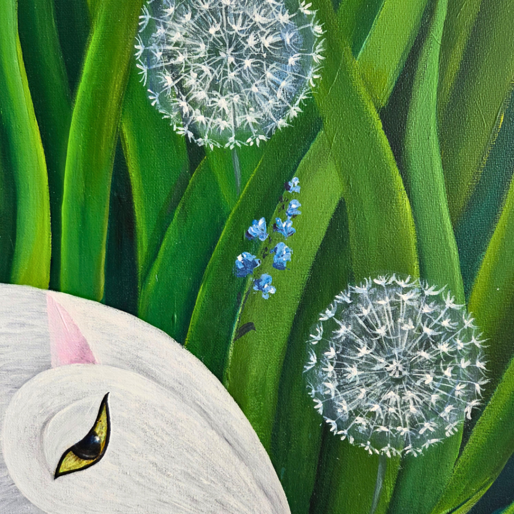
Color Relationships:
- Analogous harmony: Blues and greens for natural flow
- Complementary contrast: Coral against mint for visual impact
- Monochromatic variations: Different values of the same hue for depth
Summer Palette Intensity
Summer collections embrace bolder relationships:
Base Colors:
- Vibrant orange (sunflower centers)
- Deep red (poppy petals)
- Golden yellow (summer light)
- Turquoise (clear sky contrast)
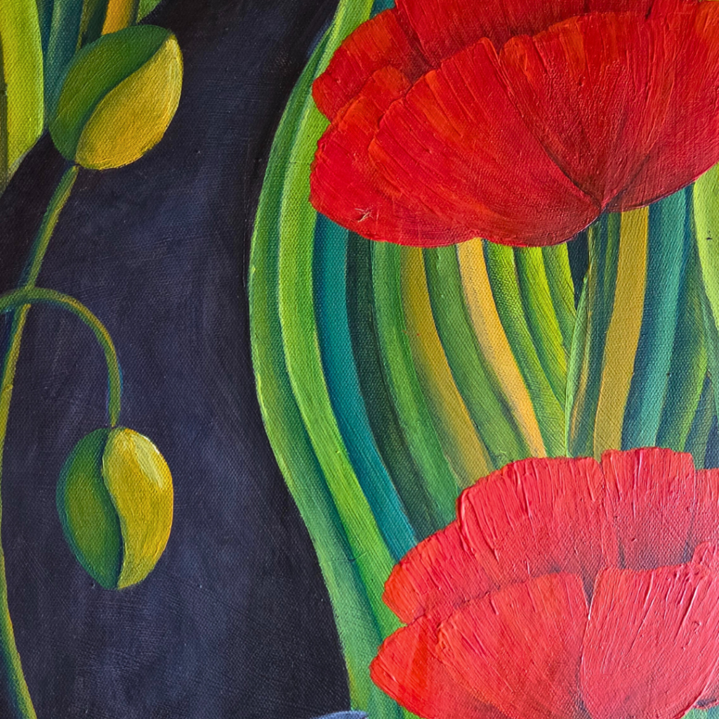
Advanced Techniques:
- Split-complementary schemes: Using colors adjacent to the complement
- Triadic relationships: Three colors equally spaced on the color wheel
- High-contrast pairings: Maximum visual impact for geometric elements
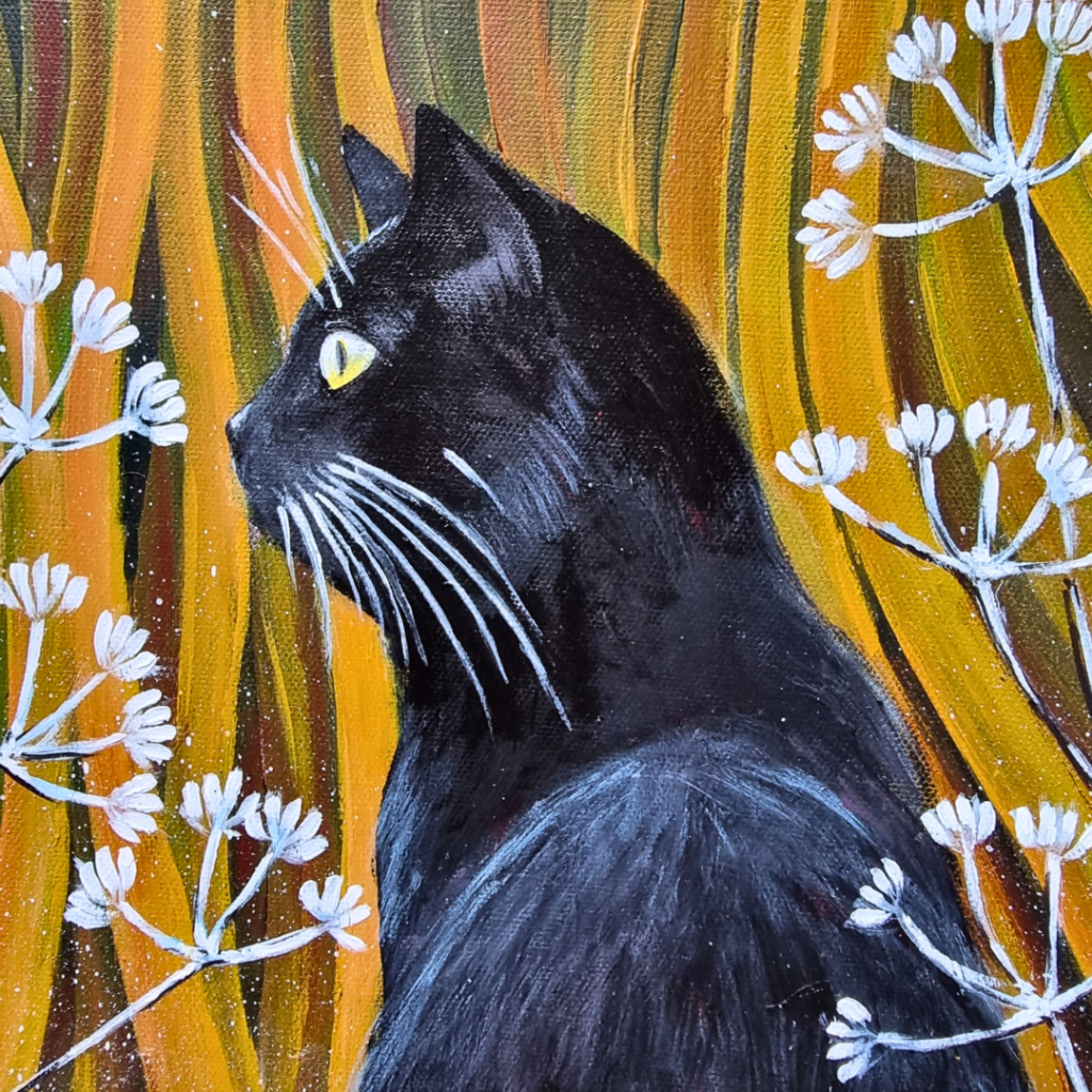
Summer Color Psychology: The intensity of summer palettes reflects the season’s abundant energy and longer daylight hours. These bold color relationships create artwork that commands attention and conveys vitality. In my “Orange Cat with Sunflowers” piece, the vertical composition amplifies the dramatic color impact—the vibrant orange against deep golden yellows creates a sun-drenched feeling that captures British summer at its peak.
Technical Considerations for Bold Summer Colors:
- Use pure pigments straight from the tube for maximum saturation
- Apply colors in geometric blocks to maintain clarity and prevent muddy mixing
- Balance intense warm colors with strategic cool accents to prevent visual overwhelm
- Consider the viewing environment—bold summer palettes work exceptionally well in bright, contemporary spaces
This approach to summer color intensity ensures your geometric nature abstractions capture the season’s dynamic energy while maintaining the sophisticated color relationships that appeal to contemporary collectors.
Autumn Palette Complexity
Autumn collections require the most sophisticated color relationships:
Base Colors:
- Rich terracotta (fallen leaves)
- Deep burgundy (late roses)
- Golden amber (harvest light)
- Sage green (evergreen contrast)
Advanced Techniques:
- Analogous progressions: Seamless transitions from yellow through orange to red
- Earth tone foundations: Grounding vibrant colors with natural browns and ochres
- Layered complexity: Building depth through multiple warm-cool relationships
Autumn Color Psychology: The complexity of autumn palettes reflects the season’s transformative nature and emotional depth. These rich, layered color relationships create artwork that invites contemplation and suggests the wisdom that comes with seasonal change. Unlike the optimistic freshness of spring or the bold energy of summer, autumn colors convey sophistication and maturity—qualities that resonate strongly with serious collectors.
Technical Considerations for Complex Autumn Colors:
- Mix earth tones as base colors to prevent oversaturation
- Use glazing techniques to build color depth gradually
- Balance warm dominance with strategic cool undertones
- Apply geometric patterns to organize complex color relationships and maintain visual clarity
- Consider how autumn colors will appear under different lighting conditions—they often become richer and more nuanced in warm interior lighting
This approach to autumn color complexity ensures your geometric nature abstractions capture the season’s sophisticated beauty while maintaining the contemporary appeal that distinguishes your work in today’s art market.
Winter Palette Minimalism
Winter collections embrace refined simplicity and structural clarity:
Base Colors:
- Charcoal black (bare tree silhouettes)
- Pristine white (fresh snow coverage)
- Golden ochre (dried winter grass)
- Silver birch (tree bark textures)
Advanced Techniques:
- Monochromatic dominance: Working within limited color families for maximum impact
- High-contrast relationships: Stark value differences that mirror winter’s clarity
- Metallic accents: Strategic use of gold and silver for winter light effects
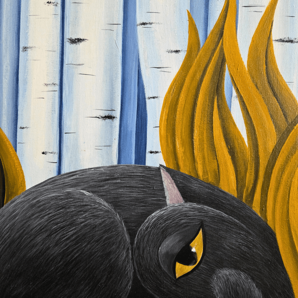
Winter Color Psychology: The restraint of winter palettes reflects the season’s contemplative nature and architectural beauty. These simplified color relationships create artwork that emphasizes structure and form over chromatic complexity. In my “Black Cat with Birch Trees” piece, the limited palette of black, white, and golden dried grass creates a sophisticated composition that captures British winter’s stark elegance while maintaining the geometric precision that defines contemporary nature art.
Technical Considerations for Minimalist Winter Colors:
- Use pure black and white for maximum contrast and geometric clarity
- Introduce warm golden accents sparingly to prevent overwhelming the cool palette
- Focus on value relationships rather than hue variety
- Apply colors in clean, geometric sections to emphasize winter’s structural beauty
- Consider texture variations within limited colors—matte blacks against glossy whites, rough golden textures against smooth surfaces
This approach to winter color minimalism ensures your geometric nature abstractions capture the season’s essential beauty while demonstrating sophisticated restraint that appeals to collectors seeking refined, contemporary artwork for modern interiors.
Advanced Color Techniques for Geometric Nature Art
Layering Colors in Acrylic
Working with acrylics allows for sophisticated color layering that enhances geometric precision:
Base Layer Strategy:
- Establish dominant seasonal colors first
- Use flat, even application for geometric clarity
- Allow complete drying between layers for crisp edges
Accent Layer Application:
- Add complementary colors in geometric patterns
- Use masking techniques for precise shapes
- Build complexity through controlled color interaction
Color Harmony in Mixed Collections
When developing seasonal collections, maintaining color harmony across multiple pieces is crucial:
Consistent Color Temperature:
- Spring: Warm undertones with cool accents
- Summer: High-temperature dominance with cool balance
- Autumn: Complex warm relationships
- Winter: Cool dominance with strategic warm accents
Proportional Color Relationships:
- 60% dominant seasonal color
- 30% supporting harmonious color
- 10% accent color for visual interest
Troubleshooting Common Color Challenges
Muddy Color Solutions
Problem: Colors appear dull or muddy Solution:
- Increase value contrast between colors
- Use pure colors for geometric accents
- Limit color mixing to maintain vibrancy
Overwhelming Color Combinations
Problem: Too many colors competing for attention Solution:
- Simplify to 3-4 main colors per piece
- Use neutral colors as visual rest areas
- Apply the 60-30-10 color proportion rule
Seasonal Color Transitions
Problem: Difficulty transitioning between seasonal palettes Solution:
- Create bridge pieces using transitional colors
- Maintain one consistent color across seasons
- Develop gradual palette evolution rather than abrupt changes
Building Your Color Confidence
Practice Exercises
Color Wheel Exploration:
- Create geometric interpretations of traditional color wheels
- Practice complementary relationships with botanical subjects
- Experiment with split-complementary schemes
Seasonal Color Studies:
- Paint the same botanical subject in four seasonal palettes
- Document color mixing formulas for future reference
- Create small geometric color studies before larger works
Professional Development
Color Theory Resources:
- Study contemporary color theory applications
- Analyze successful seasonal collections from other artists
- Attend color theory workshops or online courses
Market Research:
- Monitor trending color palettes in home decor
- Study seasonal fashion color forecasts
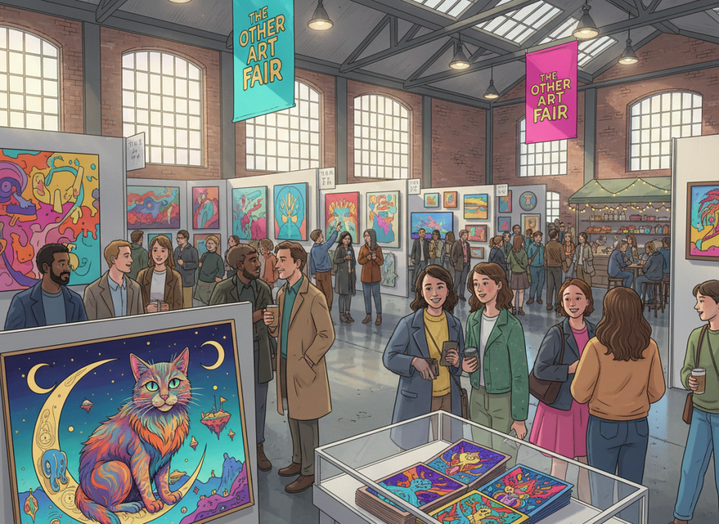
- Observe collector preferences at art fairs and galleries
Conclusion: Your Color Journey
Mastering color theory in geometric nature art is an ongoing journey that deepens with each seasonal collection. The key principles—understanding natural color relationships, applying technical color knowledge, and staying current with contemporary trends—will serve as your foundation for creating compelling, marketable artwork.
Remember that color choices should always serve your artistic vision while appealing to your target audience. The most successful seasonal palettes balance personal expression with market awareness, creating artwork that resonates both aesthetically and commercially.
As you develop your color confidence, document your successful combinations, learn from less successful experiments, and gradually build a signature color approach that distinguishes your work in the contemporary art market.
The next article in our series will explore mixed media techniques, showing how to incorporate various materials and textures while maintaining the geometric clarity and color harmony we’ve established in these foundational pieces.
- Behind-the-scenes of Artwork Creation
- History of Art
- Local Art Scene in Southend-on-Sea
- Nature and Cat Art Technics
- Navigating Social Media & AI in Art in 2025
- Seasonal Reflections
- Thoughts on AI Art, Traditional Art, and Creativity
- Uncategorized


Leave a comment