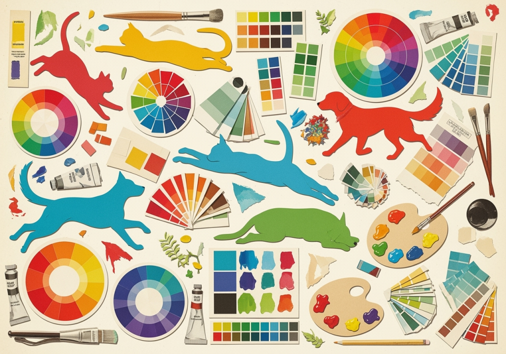
Last month, I completed two cat portraits that perfectly illustrate today’s topic. Both featured similar black cats, but the emotional impact couldn’t have been more different. The first, painted in warm golds and deep crimsons, radiated comfort and affection. The second, rendered in cool blues and silvers, conveyed elegance and mystery. Same subject, completely different emotional response – all because of colour psychology.
After five years of creating pet portraits in Southend-on-Sea, I’ve discovered that colour choices can make or break the emotional connection between artwork and viewer. Today, I’m exploring how colour psychology influences our response to pet art and how strategic palette choices can enhance the personality traits we’ve learnt to identify.
The Science of Colour Psychology
Colour psychology isn’t just artistic theory – it’s backed by decades of neurological and psychological research. When we view colours, our brains trigger immediate emotional and physiological responses that occur below the conscious level.
Neurological Colour Responses:
- Red wavelengths: Increase heart rate and stimulate the sympathetic nervous system
- Blue wavelengths: Activate the parasympathetic nervous system, promoting calm
- Green wavelengths: Balance both systems, creating feelings of harmony
- Yellow wavelengths: Stimulate cognitive function and attention
- Purple wavelengths: Trigger creativity and introspection
Dr Eva Heller’s comprehensive research on colour psychology shows that these responses are remarkably consistent across cultures, making colour a universal language for emotional communication.
Cultural and Personal Colour Associations
Whilst neurological responses to colour are largely universal, cultural and personal associations add layers of meaning that vary significantly between individuals and societies.
British Cultural Colour Meanings:
- Red: Passion, energy, love, danger, excitement
- Blue: Trust, calm, stability, sadness, professionalism
- Green: Nature, growth, harmony, envy, freshness
- Yellow: Joy, optimism, creativity, caution, intellect
- Purple: Luxury, creativity, mystery, spirituality, royalty
- Orange: Enthusiasm, warmth, playfulness, adventure
- Black: Elegance, sophistication, mystery, power
- White: Purity, simplicity, peace, cleanliness
Personal Colour Memories: Individual experiences create unique colour associations. A client might love sage green because it reminds them of their grandmother’s garden, or prefer warm oranges because they evoke memories of their childhood pet’s favourite toy.
Colour Psychology in Pet Portraiture
When applied to pet portraits, colour psychology becomes a powerful tool for emotional storytelling. The right palette can amplify personality traits, evoke specific memories, and create lasting emotional connections.
Warm Palette Benefits:
- Creates intimacy and emotional closeness
- Suggests comfort and security
- Enhances feelings of love and affection
- Evokes memories of cosy, happy moments
- Increases viewer engagement and emotional response
Cool Palette Benefits:
- Conveys sophistication and elegance
- Suggests calm and tranquillity
- Creates sense of space and breathing room
- Evokes feelings of peace and serenity
- Appeals to viewers seeking calm, meditative art
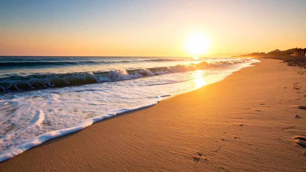
My Southend-Inspired Colour Philosophy
Living and working in Southend-on-Sea has profoundly influenced my approach to colour in pet portraits. Our coastal environment provides a natural palette that resonates deeply with local clients whilst offering universal emotional appeal.
Coastal Colour Inspirations:
- Thames Estuary Blues: Various shades from pale morning mist to deep evening water
- Beach Sand Neutrals: Warm beiges, soft greys, and weathered whites
- Pier Structure Colours: Classic seaside blues, whites, and weathered wood tones
- Seasonal Sky Palettes: Dramatic storm greys, sunset oranges, clear day blues
- Garden Colours: The vibrant greens and florals of Southend’s coastal gardens
These natural colour relationships create harmonious palettes that feel both sophisticated and emotionally resonant.
Matching Colours to Pet Personalities
The personality traits we explored in the previous article can be enhanced through strategic colour choices. Here’s how I match palettes to character:
Confident, Outgoing Personalities:
- Bold, saturated colours that command attention
- Warm reds and oranges suggesting energy and enthusiasm
- Strong contrasts that create visual impact
- Rich, deep tones that convey strength and presence
Gentle, Affectionate Personalities:
- Soft, muted tones that feel approachable and warm
- Pastel versions of warm colours
- Harmonious colour relationships without jarring contrasts
- Earth tones that suggest natural comfort and security
Intelligent, Independent Personalities:
- Sophisticated colour combinations that suggest complexity
- Cool blues and greens that convey thoughtfulness
- Monochromatic schemes that feel refined and elegant
- Unexpected colour pairings that suggest intelligence and uniqueness
Playful, Energetic Personalities:
- Bright, cheerful colours that suggest joy and movement
- Primary colour combinations that feel youthful and energetic
- High contrast palettes that create visual excitement
- Unexpected colour pops that suggest spontaneity and fun
Case Studies: Colour Psychology in Action
Let me share how colour psychology guided palette choices for recent commissions:
Luna – The Contemplative Persian Cat:
- Personality: Intelligent, independent, observant, dignified
- Colour Choice: Cool blues and silvers with touches of deep purple
- Psychology: Blues conveyed her calm, thoughtful nature; silvers suggested elegance; purple hinted at her mysterious intelligence
- Client Response: “The colours perfectly capture her regal, thoughtful personality”
Buster – The Friendly Golden Retriever:
- Personality: Outgoing, loyal, energetic, protective
- Colour Choice: Warm golds, rich oranges, and deep crimsons
- Psychology: Golds reflected his sunny disposition; oranges conveyed enthusiasm; crimsons suggested his loyal, loving nature
- Client Response: “Looking at this makes me feel exactly how Buster makes me feel – warm and happy”
Pepper – The Rescue Cat with Anxiety:
- Personality: Cautious, gentle, gradually trusting, resilient
- Colour Choice: Soft sage greens with warm cream accents
- Psychology: Greens provided calming, healing energy; creams suggested comfort and safety
- Client Response: “These colours feel like a hug – exactly what Pepper needed”
The Geometric Advantage in Colour Application
My geometric style offers unique advantages for colour psychology application. Unlike photorealistic approaches, geometric elements can isolate and amplify specific colours for maximum emotional impact.
Geometric Colour Techniques:
- Colour blocking: Large areas of single colours create strong emotional statements
- Gradient transitions: Smooth colour flows suggest movement and energy
- Pattern integration: Repeated colour motifs reinforce emotional themes
- Contrast emphasis: Sharp colour boundaries create visual and emotional drama
- Harmony creation: Geometric shapes can balance multiple colours harmoniously
For Luna’s portrait, I used geometric patterns to create a sophisticated interplay between cool blues and warm accent colours, reflecting her complex personality through colour relationships.
Seasonal Colour Psychology
Southend’s dramatic seasonal changes have taught me how colour psychology shifts throughout the year, influencing both my artistic choices and client preferences.
Spring Palettes (March-May):
- Fresh greens and soft yellows suggest renewal and growth
- Pastel versions of warm colours feel hopeful and optimistic
- Light, airy combinations reflect the season’s energy
- Popular for: Young pets, new adoptions, celebration portraits
Summer Palettes (June-August):
- Vibrant blues and warm corals capture coastal summer energy
- Bright, saturated colours feel joyful and energetic
- High contrast combinations suggest adventure and play
- Popular for: Active pets, family portraits, holiday-inspired commissions
Autumn Palettes (September-November):
- Rich oranges, deep reds, and golden browns feel warm and comforting
- Earth tones suggest stability and maturity
- Complex colour relationships feel sophisticated and thoughtful
- Popular for: Senior pets, contemplative portraits, harvest-season commissions
Winter Palettes (December-February):
- Cool blues, silvers, and deep purples feel elegant and serene
- Monochromatic schemes create sophisticated, calming effects
- Subtle colour variations suggest quiet contemplation
- Popular for: Memorial portraits, indoor cats, peaceful compositions
Client Consultation and Colour Selection
Understanding colour psychology helps me guide clients towards palettes that will create the emotional response they’re seeking. My consultation process includes specific questions about colour preferences and emotional goals.
Colour Consultation Questions:
- Emotional Goals: How do you want to feel when you look at this portrait?
- Colour Preferences: Are there colours that particularly appeal to you or your pet?
- Home Environment: What colours dominate the space where this will hang?
- Personality Emphasis: Which personality traits are most important to capture?
- Memory Association: Are there colours that remind you of special moments with your pet?
- Seasonal Preferences: Do you prefer the energy of warm colours or the calm of cool colours?
Colour Psychology Education: I often share basic colour psychology principles with clients, helping them understand how different palettes will affect their daily experience with the artwork.
The Neuroscience of Pet Portrait Colour Response
Recent research in neuroaesthetics – the study of how our brains respond to art – reveals fascinating insights about colour and emotional processing in pet portraits.
Brain Response Patterns:
- Familiar pet + preferred colours: Triggers maximum oxytocin release and positive emotion
- Beloved pet + calming colours: Activates stress-reduction pathways
- Energetic pet + vibrant colours: Stimulates dopamine and pleasure centres
- Memorial pet + gentle colours: Supports healthy grief processing and memory formation
This research validates what I’ve observed in client responses: the right colour choices can significantly enhance the emotional and therapeutic value of pet portraits.
Colour Harmony and Composition
Colour psychology works best when colours relate harmoniously within the composition. I use several colour harmony principles to create emotionally coherent pet portraits:
Complementary Harmony:
- Opposite colours on the colour wheel create vibrant, energetic relationships
- Best for: Playful, energetic pets; high-impact compositions
- Example: Orange cat with blue background elements
Analogous Harmony:
- Adjacent colours on the colour wheel create peaceful, flowing relationships
- Best for: Calm, gentle pets; soothing compositions
- Example: Blue-green-purple palette for a serene cat portrait
Triadic Harmony:
- Three evenly spaced colours create balanced, sophisticated relationships
- Best for: Complex personalities; artistic, contemporary feels
- Example: Red-yellow-blue elements in a geometric dog portrait
Monochromatic Harmony:
- Variations of a single colour create elegant, unified compositions
- Best for: Sophisticated pets; minimalist aesthetics
- Example: Multiple shades of blue for an elegant Persian cat
Cultural Sensitivity in Colour Choice
Working with clients from diverse backgrounds has taught me the importance of cultural sensitivity in colour selection. What feels positive and appropriate in one culture might carry different meanings in another.
Cultural Colour Considerations:
- Red: Lucky and celebratory in Chinese culture; associated with danger in Western contexts
- White: Purity in Western cultures; mourning in some Eastern cultures
- Black: Elegance in Western contexts; negativity in some cultures
- Green: Nature and growth universally; specific religious significance in Islamic cultures
I always ask about cultural colour preferences and associations during consultations to ensure the final palette feels appropriate and meaningful to each client.
The Emotional Journey of Colour Selection
Choosing colours for a pet portrait often becomes an emotional journey for clients. They’re not just selecting aesthetic preferences – they’re deciding how they want to remember and honour their beloved companion.
Common Emotional Responses:
- Overwhelm: Too many beautiful options can feel paralysing
- Nostalgia: Certain colours trigger powerful memories and emotions
- Protection: Desire to choose colours that honour their pet’s dignity
- Joy: Excitement about creating something beautiful and meaningful
- Anxiety: Worry about making the “wrong” choice
I guide clients through this process with patience and understanding, helping them connect with their intuitive colour responses whilst providing psychological insights about their choices.
Colour Psychology and Pet Memorial Portraits
Memorial portraits require special sensitivity to colour psychology. The goal is to create artwork that supports healthy grief processing whilst celebrating the pet’s life and personality.
Healing Colour Approaches:
- Gentle, muted versions of the pet’s favourite colours
- Soft transitions rather than harsh contrasts
- Comforting earth tones that suggest peace and rest
- Touches of brightness that celebrate life and joy
- Personal colour meanings that honour specific memories
The most successful memorial portraits use colour to create a sense of peace and loving remembrance, helping clients process their grief whilst maintaining their connection to their beloved pet.
Future Trends in Pet Portrait Colour Psychology
As our understanding of colour psychology deepens, I see several trends emerging in pet portrait colour application:
Personalised Colour Profiling: Using detailed questionnaires and colour preference assessments to create highly personalised palettes that resonate with individual clients’ psychological needs.
Therapeutic Colour Application: Collaborating with pet therapists and grief counsellors to use specific colour combinations that support emotional healing and processing.
Environmental Colour Harmony: Creating portraits that not only capture pet personality but also harmonise with clients’ home environments for maximum daily emotional benefit.
Seasonal Colour Adaptation: Offering seasonal colour variations of the same portrait to match changing moods and environmental influences throughout the year.
The Lasting Impact of Colour Choices
The colours I choose for a pet portrait will influence the viewer’s emotional response every single day. This responsibility guides every palette decision I make, ensuring that each colour choice serves both aesthetic and psychological purposes.
When clients tell me that looking at their pet portrait makes them smile, feel calm, or remember happy moments, I know that colour psychology has done its work. The right colours don’t just make beautiful art – they create daily doses of joy, comfort, and connection.
Next week, I’ll explore the sensitive topic of memorial pet portraits and how art can support the grief process whilst celebrating the lasting impact of our beloved animal companions. enhance the personality traits we’ve learned to identify and represent.
- Behind-the-scenes of Artwork Creation
- History of Art
- Local Art Scene in Southend-on-Sea
- Nature and Cat Art Technics
- Navigating Social Media & AI in Art in 2025
- Seasonal Reflections
- Thoughts on AI Art, Traditional Art, and Creativity
- Uncategorized

Leave a comment