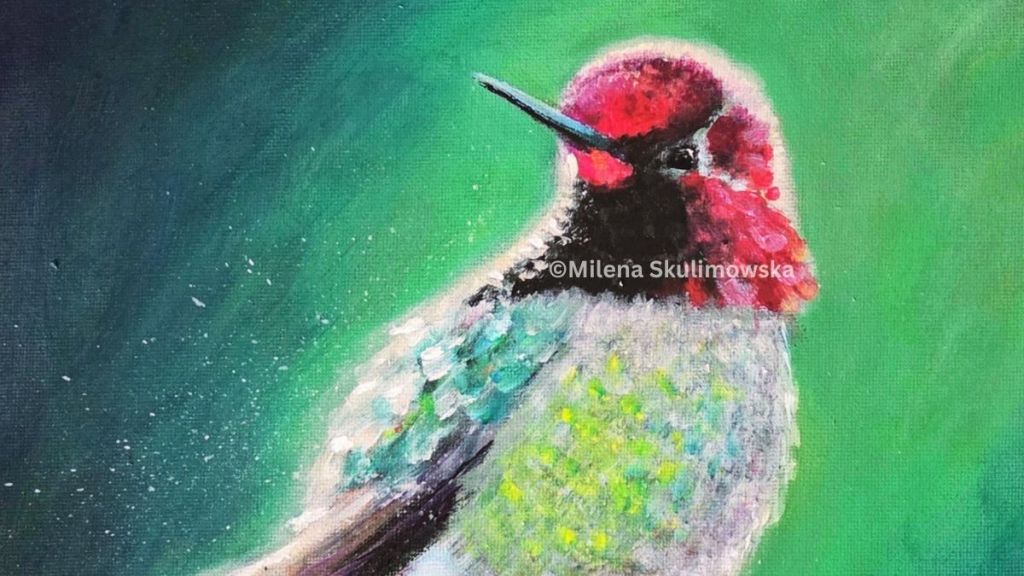
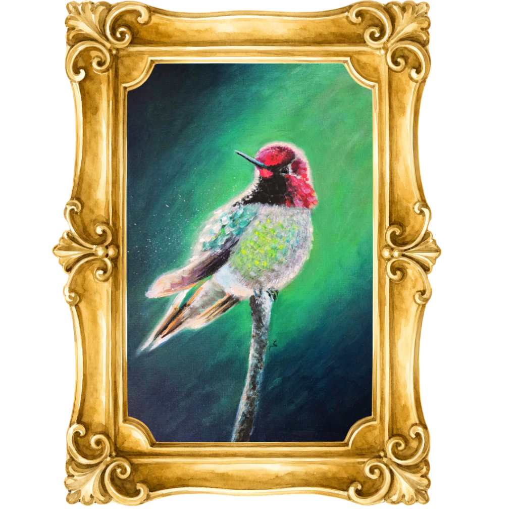
This hummingbird painting started as a simple study, but it quickly turned into one of those pieces that teaches you more than you planned. My main focus was colour—specifically, how colours change depending on what sits next to them, and how to make certain areas feel like they’re glowing without overworking the details.
Why I chose a hummingbird
Hummingbirds are perfect for colour experiments. They’re small, fast, and often look like they’re shimmering—even when the palette is quite limited. That “iridescent” feeling is less about painting every tiny feather and more about making smart colour choices that create the illusion of movement and light.
In this piece, I wanted the bird to feel like it’s hovering in a soft, atmospheric space, with the colour doing most of the storytelling.
The real goal: colour interaction
When people say a colour “pops,” it’s usually not because it’s brighter on its own—it’s because of contrast and relationships.
Here are the main things I was exploring while painting:
- Warm vs cool contrast: Reds and pinks in the head and throat feel more intense when they’re surrounded by cooler greens and blue-greens.
- Value contrast (light vs dark): A lighter edge or highlight reads as brighter when it sits against a darker background.
Saturation control: If everything is equally intense, nothing stands out. Letting some areas stay muted makes the “hero colours” feel stronger.
The palette focus: green, pink/fuchsia, and a touch of orange
This piece is really built around a green + pink/fuchsia conversation.
- Greens: I used layered greens in the background and around the body to create a calm, atmospheric space. Green is incredibly supportive—it can feel fresh and luminous, but it can also sit back and let other colours take the lead. By shifting the greens slightly cooler or warmer in different areas, the background stays soft without becoming flat.
- Pink/fuchsia: The pink/fuchsia tones in the head and throat are the emotional focal point for me. They’re bold, but they also feel delicate when they’re softened at the edges. Placing those warm pinks against the cooler greens makes them look even more intense.
- Orange highlights on the pink: I added small touches of orange as highlights within the pink/fuchsia areas. That little bit of warmth acts like a spark—orange pushes the pink forward and gives it a more “lit from within” feeling, without needing to make the whole area brighter.
It’s a simple combination, but it’s powerful: green creates the space, pink/fuchsia creates the focal point, and orange adds the energy.
Building the background to support the subject
The background is deliberately soft and blended, but it’s not “just green.” It’s layered with subtle shifts—cooler, deeper tones in some places and warmer, lighter tones in others.
That matters because a single flat background can make the bird feel pasted on. By letting the background move gently through different greens and teals, the hummingbird feels like it belongs in the space.
It also creates a perfect stage for the brighter accents in the bird’s body.
Making the colours glow
One of my favourite parts of this study was pushing the illusion of glow. Instead of reaching for extremely bright paint, I focused on placement:
- Small, high-impact highlights: Tiny light marks can do more than large bright areas.
- Soft transitions around the focal point: A slightly hazy edge can suggest light scattering.
- Strategic complementary notes: A hint of a contrasting colour can make the main colour feel more alive.
That’s how you get that “sparkle” effect—especially in feathers—without painting every single detail.
What I learned from this piece
Every colour decision affects the next one. This painting reminded me that colour is never isolated—it’s always in conversation with what surrounds it.
If you’re an artist, this is a great exercise to try:
- Choose a subject with natural colour variation (birds are ideal).
- Limit your palette.
- Focus on relationships rather than realism.
- Step back often—colour interaction is easier to judge from a distance.
A little motivation
There’s something quietly motivating about doing a “study” that turns into a finished piece. It’s a reminder that you don’t always need a huge plan—sometimes you just need a clear question to explore.
For me, the question was: How do I make colour feel alive?
If you’re working on something creative this week, consider giving yourself a small challenge like this. Pick one skill—colour, light, texture, composition—and let the piece be about learning.
Because the best part is: you don’t just end up with practice. You end up with art.
Want to see more behind-the-scenes?
If you’d like, I can also share a short breakdown of the palette I used, plus a few tips on photographing colourful paintings so the vibrancy shows up properly online.
- Behind-the-scenes of Artwork Creation
- History of Art
- Local Art Scene in Southend-on-Sea
- Nature and Cat Art Technics
- Navigating Social Media & AI in Art in 2025
- Seasonal Reflections
- Thoughts on AI Art, Traditional Art, and Creativity
- Uncategorized




Leave a Reply